Just over a year ago, our Bard team began an exciting new project to reimagine our visual identity, to be a new and eye-catching reflection of what Bard truly is today.
Artistic Director Christopher Gaze explains: “We started by appreciating that we are successful, and that our “look” has been recognized and admired for years by our many fans and followers. But then we asked ourselves a challenging question: is that “look” sparking curiosity and excitement beyond our immediate circle, to those who are not really aware of what we do in Vanier Park every summer and beyond? Does it fully convey what Bard is today – a modern, vibrant, professional theatre presenter and educator?”
And so we began a journey of exploration. We held wide-ranging conversations with our own followers and friends and we commissioned professional market research, to get feedback from those who know us well as well as those who don’t. It ultimately led us to a new partnership with the award-winning Vancouver graphic design and branding firm, Carter Hales Design Lab. The result of all this is a fresh and original new look for Bard, and now we’re ready to pull back the curtain and show it off to you!
The New Logo
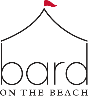
We’re very excited about our new Bard logo (or brandmark – the technical term). From the first moment we saw it, we loved the inspired pairing of the silhouette of a tent – the heart of our Festival – with the single word people so often use to describe us: we are simply “Bard”.
The Season Look
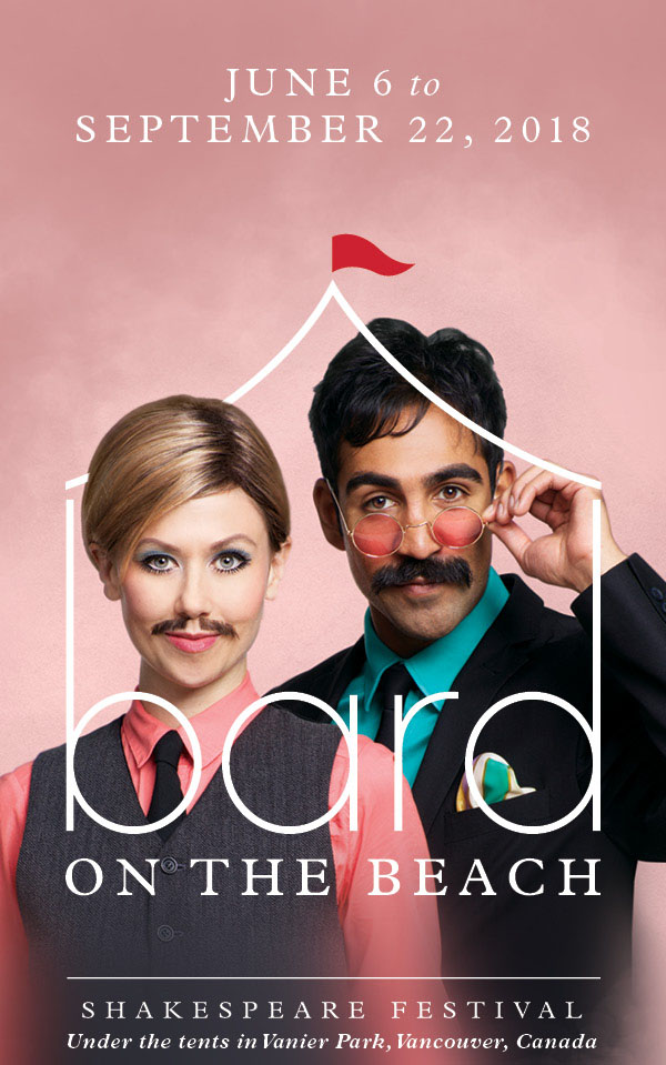
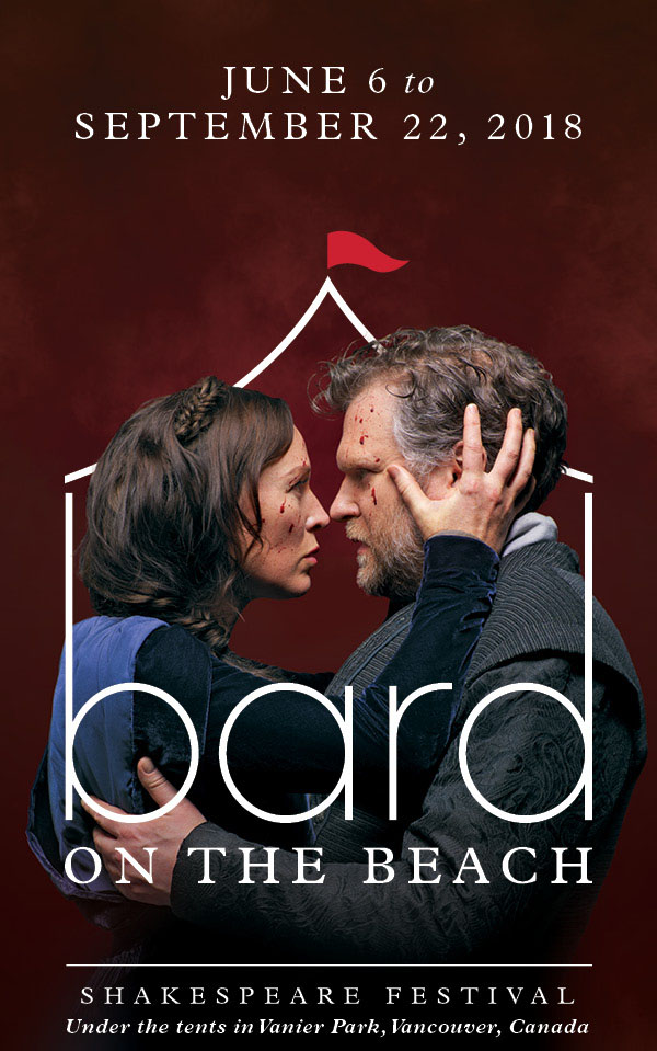
Lindsey Angell & Nadeem Phillip, As You Like It and Moya O’Connell & Ben Carlson, Macbeth. Photos by David Cooper
Carter Hales turned to our dramatic early-season play photography, as its team designed our upcoming season’s print materials and website home page. They created a look that artfully positions photos from our upcoming productions As You Like It and Macbeth within the Bard tent ‘frame’. The idea is to virtually transport you through the doors of our tents and into our theatres, where we bring you Shakespeare’s great comedies, romances and tragedies – and more!
The Education Sub-Brand

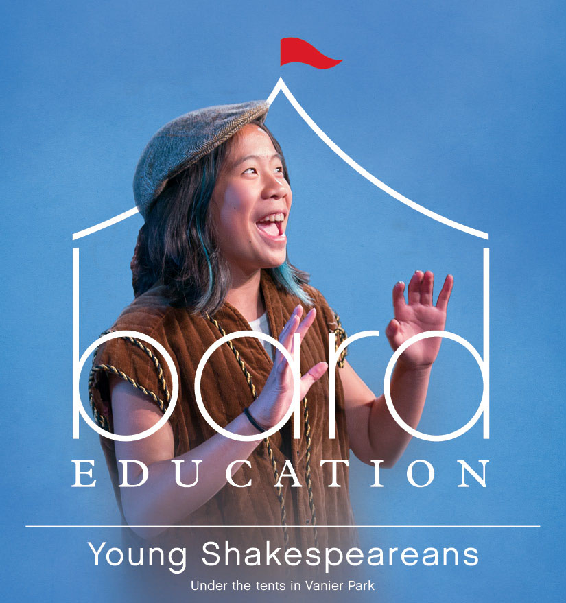
Bard Education designs and programs a wide range of learning experiences and materials for youth, schools and the general public along with specialized training for theatre professionals. This sub-version of the new look, with its modified logo, allows Education to reflect its own brand with its unique year-round programs and activities, while clearly linking it to the Festival and the Bard organization as a whole.
Coming soon: What you see here is just the beginning – there’s so much more to unveil and celebrate. Keep watching our online spaces and print materials in the weeks and months to come, to see the entire scope of our fresh look as it rolls out into our 29th season and beyond!
Guest post by Heather Kennedy, Bard’s Marketing & Communications Director


January 22, 8:57 am
I like that the new logo incorporates the tent and flag, as those were the iconic symbols of the festival. It is still recognizable as Bard on the Beach, but more modern. I think it will draw in new patrons, especially younger ones who may have thought Shakespeare is too stuffy for them.
January 19, 9:02 am
I think it will encourage a new crowd – the old logo did look a bit like a circus! But what emoji can we use now? Haha! 🎪
January 18, 8:20 pm
Love it too! – as a stand alone design, and how it is also being actively incorporated into the “season look”, and sub-brand. Gold stars to all involved.
January 18, 7:14 pm
I love it. Sophisticated, contemporary, and puckish.
January 18, 3:51 pm
Simple, clear, and fun with the red flag. You’ve followed the KISS principle to a “T”ent.
January 18, 2:58 pm
Clever and effective design!
January 18, 1:52 pm
Love it – it’s so clean and modern.Respectful of the old image but fresh. I love how the play images can nestle inside.
BRAVO! Well done 👍
January 18, 1:42 pm
I love love love it! So fresh, so simple, so clear – i think the look will attract people who never took a second look before because the old brand was too familiar and old-style. This new branding is exciting and encourages those who haven’t come before to check it out. Kudos to all!!⏰ it was time!
January 18, 1:38 pm
Whoever designed your new logo did a fabulous job. Well done and so perfectly representative of the Lions.
January 18, 12:40 pm
Looks great; I wish we were still living in Vancouver, so we could keep enjoying BARD.